Spread bets and CFDs are complex instruments and come with a high risk of losing money rapidly due to leverage. 71% of retail investor accounts lose money when spread betting and/or trading CFDs with this provider. You should consider whether you understand how spread bets and CFDs work and whether you can afford to take the high risk of losing your money.

Technical analysis: an advanced guide

Technical analysis is a form of analysis used by traders to evaluate future price action​​ based on historical price data. Such statistics include things like price movement and volume, which can give indications of market sentiment. Many traders use technical indicators and charting analysis as an approach to analyse the markets and spot potential trading opportunities and suitable entry and exit points. This article looks at five advanced approaches to technical analysis to help you improve your technical trading strategy.

See inside our platform

Get tight spreads, no hidden fees and access to 12,000 instruments.

What is technical analysis?

Technical analysis is the evaluation of a financial asset through the study of historical market statistics. Technical analysts don’t believe that market price movements are random. Rather, they believe that these movements create identifiable patterns and trends that repeat over time. Consequently, they use this analysis to try and forecast the future price movements of financial assets, or securities.

Typically, technical analysis is based on three theories:

  1. The market discounts everything. In other words, everything you need to know about a security can be found in its price. For this reason analysis should focus on price charts​​​ and movements.
  2. Price moves in trends. Market prices are more likely to continue past trends than to move erratically.
  3. Trends repeat over time. Technical analysts believe that history tends to repeat itself. Therefore, past trends can be used to help interpret future price movements.

Technical analysis of the financial markets

There are numerous technical trading indicators​​​​ that have been developed by analysts. They use these indicators to attempt to accurately forecast future price movements. Technical indicators are mathematical calculations which point to trade entry and exit signals. Trade signals help investors decide whether to buy, sell or hold a security or financial instrument. Technical indicators are generally used with charts. Indicators are placed over chart data to try and predict the price direction and market trend.

There are different ways that traders can use technical indicators. For example, some try to determine the strength of a trend, and how likely it is that the trend will continue. Others focus purely on identifying current market trend​​. Moving averages, chart patterns, stochastic oscillator, and support and resistance lines are some of the indicators used to predict price patterns in the financial markets.

Join a trading community committed to your success

Technical analysis indicators explained

Trading charts

Chart patterns are the most fundamental aspect of technical analysis. A technical analyst uses charts as the source of any information they are gathering. There are different types of charts used by traders, depending on their trading goals. The four primary types are line charts, bar charts, candlestick charts​​, and point and figure charts.

Technical analysts also use chart patterns to help them identify trading signals. They believe that certain trading patterns​​ tend to reappear, and generally produce similar outcomes. The best place to start is by studying long-term charts, such as monthly and weekly charts spanning several years, as these give a good overview. Once a trader has gained this perspective, daily and intraday charts can be consulted. This approach helps, because a short term view in isolation can be deceptive.

Trends

Being able to identify trends is one of the most important concepts of technical analysis. The trend indicates the general direction that a market is heading. However, identifying trends is not always straightforward because prices rarely move in straight lines. Instead, they move in a series of highs and lows and it is the overall direction of these highs and lows which establish a trend.

There are three types of trendlines​​: uptrends, downtrends and sideways trends. An uptrend is signalled by a series of higher highs and higher lows, while a downtrend consists of lower lows and lower highs. A sideways trend is when there is little movement up or down. Trendlines are a simple charting technique where straight lines are used to connect lower lows or higher highs. This helps to show the general direction of the trend. Plus, they can help traders to identify areas of support and resistance.

Support and resistance

Support and resistance​​ levels are another important concept of technical analysis. They are areas on a chart where the market’s price struggles to break through. Support levels are formed when a falling market reaches a certain level, and then bounces. Resistance is formed when a rising market hits a high and then falls. The more times a market hits these points of support or resistance and reverses, the more reliable that projected line will be for future levels. They can be used to help make trading decisions and can indicate when a trend is about to reverse.

Correlation

Some stock movements are dependent on each other, with a clear relationship. This correlation and dependence can be of interest in technical analysis. When the prices of the two stocks move in a similar direction, they are correlated, or dependent. For example, let's say the price of oil is increasing. Gas prices have a tendency to rise as well whenever this happens. This means that they have a positive correlation. When the price of two commodities consistently move in opposite directions, they are negatively correlated. Two stocks moving independently of each other without any correlation can help with portfolio diversification. This is because when some shares in a portfolio are losing money, other non-correlated shares might still be gaining.

Moving averages

Given the volatility of price movements, chart patterns can be difficult to read. Technical analysts can use moving averages to help with this. Moving averages can remove day-to-day fluctuations, making price trends easier to spot. They are also useful for identifying support and resistance levels. Moving averages work by taking the average of past price movements. This means they are better for accurately reading past price movements, but are less suitable for forecasting future movements.

The most common type of moving average is the simple moving average​​. Other popular types are the exponential moving average and linear weighted moving average. The most popular periods used for calculating moving averages are 50, 100 or 200 days.

Powerful trading on the go

Seamlessly open and close trades, track your progress and set up alerts

Trading with technical analysis

Lots of traders use candlestick charts when looking at price action data and it is easy to see why. Candlesticks present the battle between buyers and sellers in a very simple-to-interpret graphical way. Candlestick charts also have their own range of patterns, with many focusing on the psychology of the market and constant battle between buyers and sellers.

Below are some of the most significant technical analysis patterns to spot when trading.

Bullish engulfing pattern

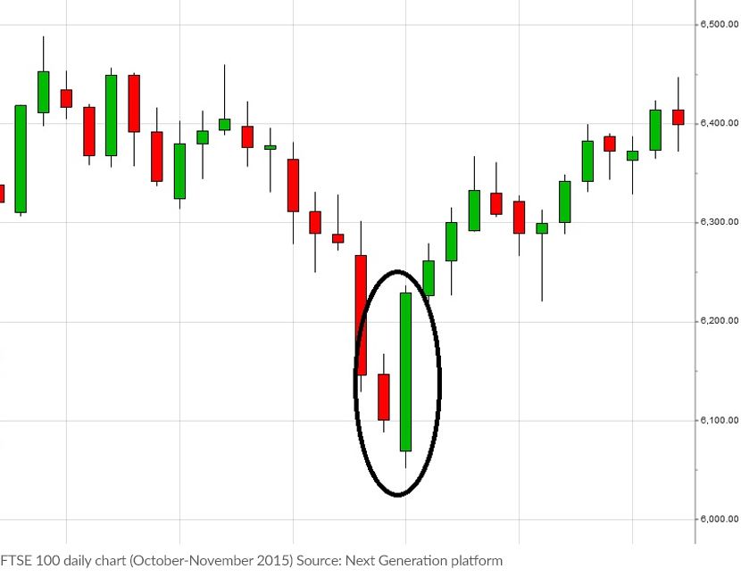
The bullish engulfing pattern occurs when a market has been in a downtrend. Bullish engulfing patterns usually consist of two complete candlesticks spanning two time periods (for instance one hour or one day). The first is a 'down' or bearish candlestick, followed by an 'up' or bullish candlestick covering the subsequent time period.

The size of the first candle can vary from chart to chart. The first candle usually signifies the end of declining prices for the markets. The second candle in the pattern should be bigger than the previous candle and should cover (or engulf) the 'body' of the previous candle. The bigger the second candle and the higher it advances, the stronger the signal.

Here is an example of the FTSE 100 index based on daily candlesticks.

In this example, the market had been falling for more than a week but there is a relatively large 'up' day that completely overshadows the previous day’s candle. These two candles together form the bullish engulfing pattern and suggest that weakness is coming to an end and the trend may be about to reverse.

Bearish engulfing pattern

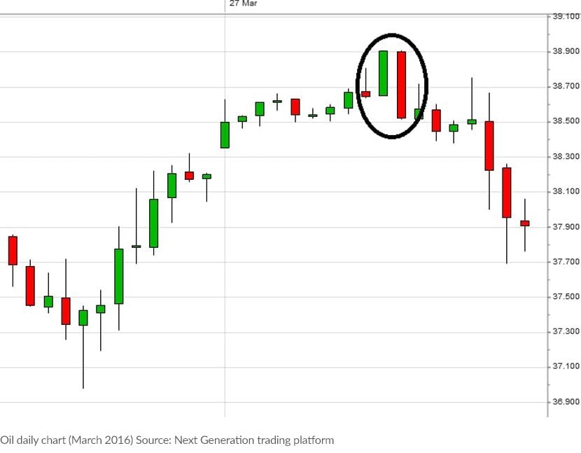
Bearish engulfing patterns are a mirror image of the bullish variety, with the difference being that with bearish engulfing patterns the market is heading higher, but then there is a candle in the opposite direction to the trend which engulfs the previous candle – signifying a change in sentiment from buying pressure to selling pressure.

As with the previous candlestick chart pattern, the first candle in this formation signifies that the current trend is coming to an end. The size of the first candle can vary from chart to chart and it is the second or 'engulfing' candle that signals the change in trend. To qualify as a bearish​​ engulfing pattern, the second candle must completely engulf the previous candle. Ideally, the high should extend above the previous candle's high and a new low should be created – signifying renewed downward selling pressure.

The below example shows the price of oil, and each candle represents one hour of trading. Learn more about trading with different chart timeframes​.

As with all other trading strategies, candlestick charts should be used in conjunction with other forms of analysis to weigh up when market sentiment may be shifting.

Bullish divergence signal

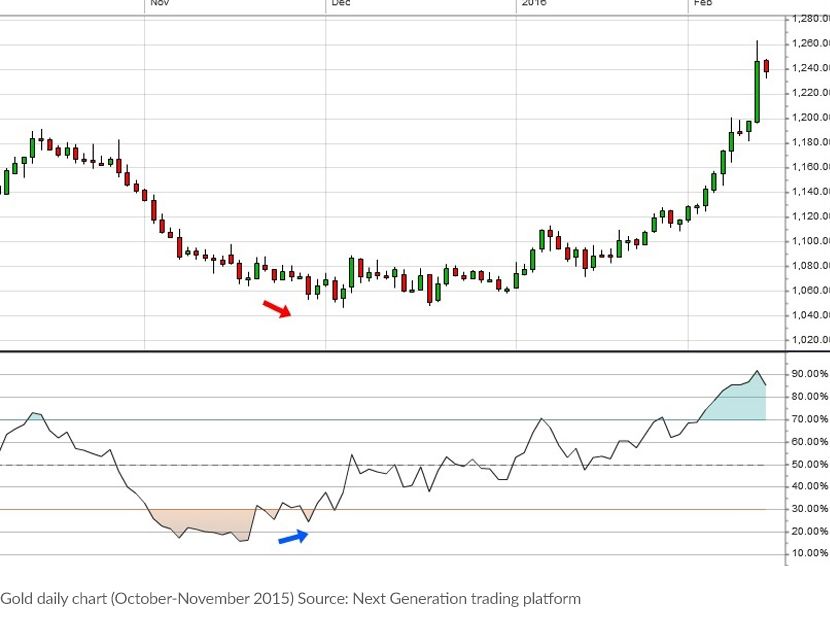
Many traders will use technical indicators to figure out market direction. You may have seen charts with stochastic oscillators, moving average convergence divergence (MACD) and other lines underneath the price. One variation of the indicator approach is to look for divergences. This is where the price does one thing but the indicator does something else – it can be a sign that a trend is running out of steam, offering the opportunity to profit from a move in the other direction. In the chart below, the price of gold has a relative strength index (RSI​) shown below the price, which is always a popular indicator.

In the chart above, it can be seen that there is a significant slide in the price of gold, as indicated by the red and blue arrows, and the RSI becomes very oversold, pointing to how weak the market has been. Later in the same month and the following month, the price of gold slips further, below those previous lows. But interestingly, the RSI has started moving higher. This is bullish divergence – and can be a suggestion that the downtrend is running out of steam, which proved to be the case in this example.

Bearish divergence signal

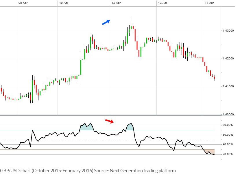
For every positive pattern, there is usually a negative alternative and this is also the case when it comes to divergence. When a market is making higher highs, but the RSI is not following suit, this is referred to as 'bearish divergence' and can be a warning that a top is near. The example below is an hourly chart for the GBP/USD forex pair. As indicated by the blue and red arrows below, the market was strong towards the middle of the month but the RSI then makes a lower high than previously, suggesting that momentum may be starting to fade away.

This divergence approach using indicators is thought to be more reliable than just using them as simple overbought or oversold signals. As ever, nothing works all the time but they can help to 'take the temperature' of a market and act as a warning that a previously good trend could be about to stall.

The false breakout

As mentioned before, no trading strategy is right all of the time but even false signals can give a hint into market direction. The breakout strategy is a popular one with momentum traders​​: when a previous low or high is broken on the chart some will see it as the sign of a new trend. But a lot of the time this does not happen. This false breakout can still give us an aggressive trading strategy and is a useful bit of technical analysis on its own. Learn how to identify breakout stocks​.

Join a trading community committed to your success

Fundamental vs technical analysis

Technical analysis and fundamental analysis​ are the two main approaches to analysing securities. As we’ve seen, technical analysis looks at price movements and uses this data to try and predict future price movements. It uses techniques like statistical analysis and behavioural economics. Fundamental analysis, on the other hand, attempts to measure the intrinsic value of a security. It involves the study of overall economic and industry conditions. It also looks at the financial conditions and management of companies through company analysis​. Things like earnings, expenses, assets and liabilities are important to fundamental analysts.

Technical analysis and fundamental analysis are often seen as opposing approaches. However, it is possible to combine the two. A technical analyst may use fundamental analysis to support some of their trades, and vice versa. For example, fundamental analysis could be used to research an undervalued stock. Technical analysis could then be used to find a specific entry and exit point.

The main differences between fundamental and technical analysis

  • Technical analysts generally begin their analysis with charts, whereas fundamental analysts typically research a company’s financial statements.
  • Technical analysts try to identify short to medium-term trades where they can profit from market trends, whereas fundamental analysts take a longer-term approach.
  • Technical analysis focuses on strategies such as scalping and day-trading, whereas fundamental analysis focuses on long-term swing and position trading strategies.

As a new trader, which path should you follow and what approach works best? The honest answer is both! It is possible to make money using either technical or fundamental analysis, but maybe there is a happy middle ground where a blended style could give the best outcome.

It certainly pays to be aware when major fundamental news is being released. At the very least, even the most committed chart traders should know when the various central banks around the world are due to announce interest rate or other policy decisions. This, coupled with the release of major data such as unemployment numbers, can really move the markets. Trading with a head-in-the-sand approach around these releases can be expensive, as market volatility often picks up.

Which technical analysis strategy is best?

All of the above strategies can be used effectively within the financial markets​, so you can pick a form of technical analysis that is best suited to your trading plan and overall goals.

When it comes to trading risk management​, this is another area where a combination of the technical and fundamental approach could work. Economic news may tell you that the market's attitude towards a certain financial asset is changing but it does not necessarily tell you when your view on the market is wrong. Using traditional chart points such as support and trend, for example, the fundamentally-biased trader can manage the risk on his revised market view if that proves ultimately to be incorrect.

It is maybe not too surprising then that there is no definitive answer for the best form of technical analysis, and the argument between the fundamental and technical approach is destined to rage on. However, there are plenty of different and profitable trading strategies out there – be they purely technical, fundamental or a mix of the two. It’s all about finding a methodology that fits with your own particular trading personality. Learn about the 7 most popular trading strategies and how to put them into practice.
Powerful trading on the go

Seamlessly open and close trades, track your progress and set up alerts

Hello, we noticed that you’re in the UK.

The content on this page is not intended for UK customers. Please visit our UK website.

Go to UK site